
Introduction
We had to make a image using a photo editor (Photoshop, Clip Studio Paint, etc.) and make the atmosphere the opposite. for example if the image is Sunny then make it moody or the other way around, etc.
Hue and Saturation
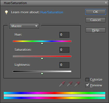
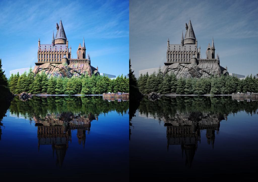
I have used a Colour wheel and the Hue/Saturation tab to change the colour of the image to make a bit darker and more moody.
Choosing Colours
I tried using multiple colours to give it a moody feel, Light Blue was my first choice of trying to make the image more moody. I didn’t give me the feel that I wanted, It looked to Bright and Wet, so I tried to go for something else.
Chosen Colour
The second option was Grey, It helped make the Image look more dull, sky looks drained along with the trees. I felt better with Grey then the other colours used, so I stayed with Grey, brought down the Brightness slightly and changed Saturation a little.
What was Challenging to me?
Making the Image go moody proved a slight challenge but with tweaking, I was able to understand what colour help out with changing the mood of an Image.
What Have I Learned?
I have learned how to make a Bright Image through Photoshopping turned into a cloudy, moody image. I have learned to use Colour to change the mood of the image and alter the environment.